


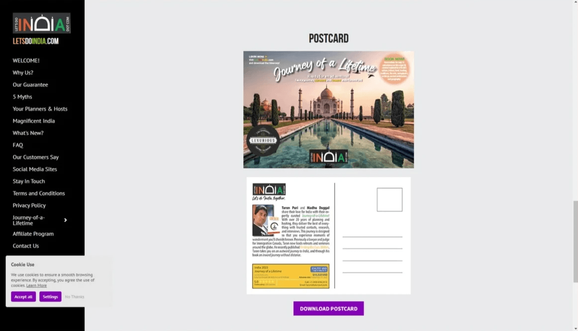
Let's Do India
Your gateway to a journey of a lifetime!
Title Text
Rebranding & Website Design
In an industry of travelers who share a global wanderlust, where dreams of ancient spices and mysteries of ancient historical sites collide with fears of the uncharted, Taron Puri reached out to me at Jorgensen Designs. For two decades, Let's Do India had thrived on the intimacy of personal connections and recommendations of past travelers, Taron's emails to his network, and local presentations that vividly described his guided tours through India's labyrinthine wonders.
But as the world shrank under digital technologies his company's unparalleled expertise in crafting "trips of a lifetime"—bespoke journeys or hosted group adventures led by him and his sister Madhu Duggal—was trapped in a cocoon, invisible to discerning explorers around the globe craving luxury without compromise.
"We need to emerge," he said with the strength of a healer coaching a client to go beyond his comfort zone. This plea initiated our collaboration: a rebrand to catapult Let's Do India into the spotlight as a beacon of authentic, soul-stirring Indian travel, addressing the unspoken fears of first-timers—unreliable transport, cultural faux pas, sudden shrine closures—while celebrating the duo's extraordinary lives as the ultimate human bridge to India's essence.
Our journey began with a competitive analysis that laid bare the landscape like an archaeologist unearthing forgotten scrolls. We dissected rivals offering customized India escapes, pinpointing their strengths and weaknesses. From this emerged Let's Do India's unique guarantee of satisfaction—a service built on empathy, guaranteeing food and dietary preferences, chauffeured elegance in air-conditioned tour buses, vigilant safety protocols, and immediate solutions for life's plot twists, like a temple's untimely closing. Yet the true competitive advantage pulsed in the veins of Taron and Madhu themselves: siblings whose experience and character wove trust into every booking.
Taron, once an Immigration Canada judge, traded gavels for gurus. He authored Finding the Guru Within, hosts a podcast on body, mind and soul wellness, and leading retreats that blend India's spiritual tapestry with intuitive coaching on health and growth. His journeys aren't mere sightseeing; they're inward odysseys, where guests unearth personal epiphanies amid India's beauty. Madhu, her effervescent counterpoint, channels her culinary sorcery from street cuisine to haute palace feasts and market-savvy hunts for artisanal treasures. Her warmth ensures no detail escapes her radar. Together, they promise not vacations, but transformations: off-the-beaten-path immersions, tailored to soul-deep experiences and cultural odysseys that etch loyalty forever. This demands a brand that whispers sophistication while roaring authenticity.
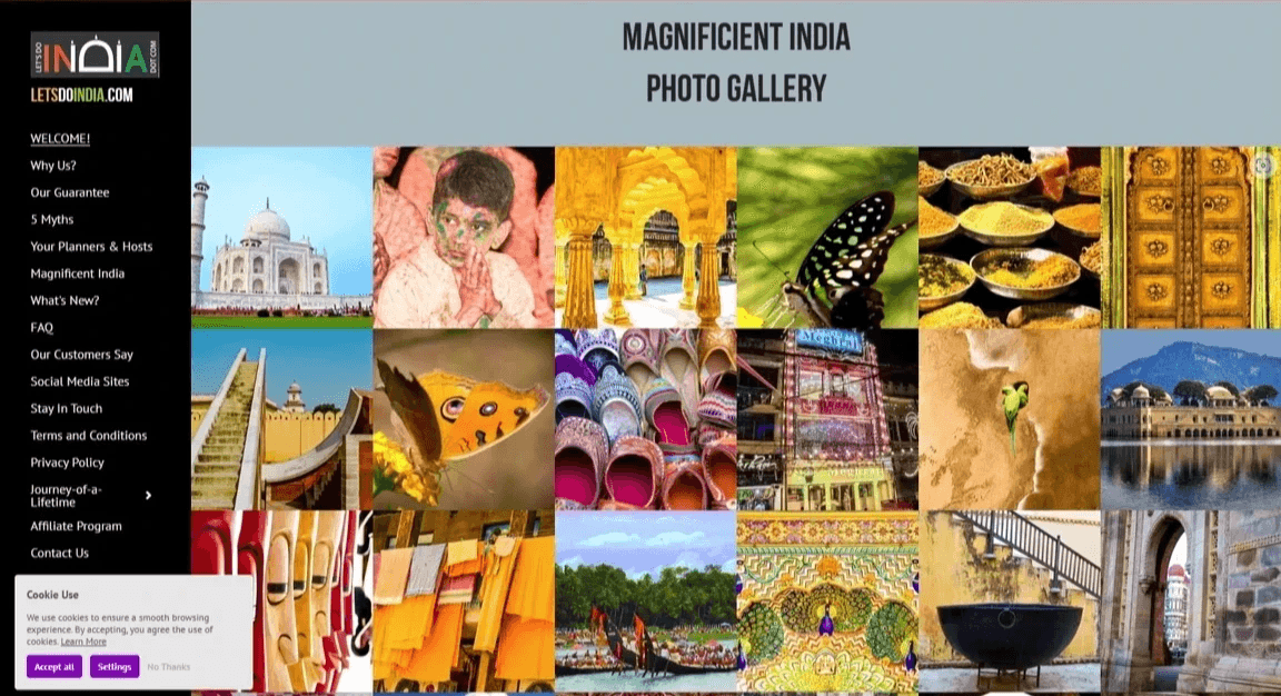
As we dove into creation, the iterative forge tested our mettle like a Himalayan trek—endless refinements amid twin tyrants: a shoestring budget stretched thin by post-pandemic ripples and a timeline compressed to mere months before peak booking season. Early sketches for the logo faltered; my initial Taj-inspired doodles felt too ornate, clashing with the clean luxury we craved, forcing late-night ethical debates: How do we honor India's opulence without veering into cliché? Collaborating remotely with Taron and Madhu via Zoom hearthside sessions, we unearthed synergies—their stories fueling my empathy, revealing how a designer's oversight could unwittingly sideline a traveler's cultural reverence. We adapted, prototyping three logo variants in Figma, each embedding "INDIA" as a stylized Taj Mahal silhouette: the "D" blooming into its iconic dome, "I"s rising like minarets, evoking heritage without mimicry. Constraints bred ingenuity; with no room for lavish photo shoots, we sourced ethical stock imagery of gilded palaces and spice-laden bazaars, curating a palette drawn from India's flag—saffron's bold courage for vitality, white's serene purity for balance, teal's verdant promise for prosperity—ensuring versatility across web and print.
Validation came as our triumphant dawn: A/B testing on a beta site with 50 proxy users (Taron's network standing in for global voices) revealed the winning logo boosted recognition by 40%, its memorability ranking it second only to the real Taj in instant recall among icons. Website wireframes iterated thrice, user heatmaps exposing pain points like buried bios, which we resolved by foregrounding Taron and Madhu's narratives in immersive, scroll-triggered vignettes. The final site—a symphony of high-fidelity photography, kinetic graphics, and prose that read like Madhu's fireside tales—outshone competitors' sterile portals, driving a 25% uptick in inquiries during soft launch. Yet beyond metrics, this project humanized my craft: Taron's mid-process confession of imposter syndrome as a "spiritual judge" mirrored my own design doubts, fostering a collaborative resilience that turned pixels into portals of trust.
In reimagining Let's Do India, we didn't just craft a brand; we summoned a siren call to the world's adventurers, proving that true design thrives where vulnerability meets vision—transforming a local legend into a global heartbeat, one soul-stirring journey at a time.

Meet Taron Puri and Madhu Duggal: Your expert guides to India
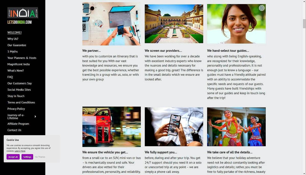
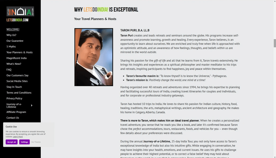
What sets Let’s Do India apart from similar competition are the extraordinary accomplishments and vibrant personalities of the owners, Taron Puri and Madhu Duggal. They create a human connection that fosters trust and loyalty for travelers. They host the group tours, and select and approve every aspect of individualized tours with virtual hosts. Let Taron and Madhu guide you through the heart and soul of India. With over 22 years of experience hosting the Journey-of-a-Lifetime Adventure, they offer:
- Authentic experiences that go far beyond typical tourist paths
- Personalized itineraries tailored to individual preferences
- Exclusive access to local markets, artisans, and culinary treasures
- Let’s Do India provides a connection to the soul of India through two extraordinary hosts who have spent decades perfecting the art of creating meaningful, transformative travel experiences.
Taron’s highlights:
- After a successful legal career, including a distinguished role as an Immigration Canada judge, he answered a deeper calling—as a healer, teacher, and personal coach.
- With a lifetime dedicated to the study of Indian spirituality and culture, Taron brings profound insight to every journey.
- Author of Finding the Guru Within (1992)
- Host of a widely-followed podcast on healing and spirituality
- Creator of transformative retreats and seminars
- Intuitive guide with deep insights into health, emotions, and personal growth
- Traveling with Taron offers guests a rare perspective on India, enriched by his intuitive abilities and his expansive knowledge of the country’s spiritual heritage. Each adventure becomes a path of discovery, both within and beyond.
Madhu Duggal: Culinary expert and shopping guru
- Madhu complements her brother’s spiritual depth with her vibrant love for Indian culture, cuisine, and commerce.
- Her engaging personality and connections to India’s bustling markets make her an expert guide for those seeking the country’s best-kept secrets—whether it's the perfect dish or the ideal souvenir.
- Expert in a wide array of Indian cuisines, from street food to fine dining
- Savvy shopping guru with an eye for uncovering hidden gems and great deals
- Master at curating personalized experiences that cater to individual tastes
- Attentive host known for her warmth and attention to detail
- With Madhu at your side, every aspect of your journey will be carefully tailored to your preferences, ensuring an experience that is both memorable and deeply personalized.

Engage, inform, sell, and convert:
The multi-layered strategy of newsmagazines
One of my key projects involves designing natural health "newsmagazines" to highlight specific products. These are created by Purity Life Health Products, a large North American natural health manufacturer and distributor. To drive consumer demand, the newsmagazines feature select products along with current research and use information.
Over 50 million copies are distributed across four countries, significantly boosting product sales. The campaign includes a toll-free number for consumers to find retailers who carry the featured products, request additional information, or sign up for future issues and receive coupons.
This strategy not only builds a highly targeted mailing list but also provides valuable insights into consumer interest and product popularity based on the volume of calls received. It also identifies who these consumers are with demographic data. Marketing demographics include characteristics such as age, geographic location, education level, occupation, income, etc., that are used to create groups and segment a market.
Strategic design and marketing effectively layer function and purpose to achieve multiple goals simultaneously. In the case of natural health "newsmagazines," the most apparent function is to drive demand for products and boost sales. This is achieved by spotlighting key products, educating consumers about their benefits, and creating a sense of urgency to try them.
The second layer of purpose revolves around collecting valuable demographic data. By encouraging consumers to interact with the brand, whether through signing up for future newsletters, requesting coupons, or providing retailer information, companies build a targeted database. This demographic information is essential for refining marketing strategies, tailoring future communications, and expanding the potential audience.
A third and equally important layer is consumer engagement. These newsmagazines foster an interactive experience by inviting consumers to call toll-free numbers for more information, connect with product experts, or locate nearby retailers carrying the product. This not only enhances consumer participation but also deepens their relationship with the brand, building trust and loyalty.
In essence, the design is crafted to engage the consumer at multiple touchpoints, transforming passive readers into active participants and long-term customers. This layered approach ensures that the campaign goes beyond immediate sales to build a lasting relationship with the audience while simultaneously collecting actionable data for future marketing initiatives.

Unexpected consumer reactions
Know thy audience!
In 2024, it's common to see images of individuals practicing yoga in natural supplement ads. However, when I first introduced this concept for Moducare, it sparked an unexpected reaction. The company received over two dozen complaints from consumers who perceived yoga as a religious practice and were uncomfortable with its presence in a supplement ad. The company's owner, concerned by the negative feedback, considered removing the imagery from future campaigns.
I remained resolute in my vision, explaining that the target audience for Moducare overlapped with those who practiced yoga—both groups focused on holistic health and wellness. The pushback was primarily from older, more conservative consumers who misunderstood yoga's evolving role in modern society. Today, yoga is widely embraced across communities of all sizes—not as a religious practice, but as a means of enhancing flexibility, emotional balance, and physical strength. Its integration into wellness and health is now seen as a natural and effective way to maintain longevity and minimize aging.
Natural health consumers are a unique group, particularly when faced with health challenges. They tend to be deeply invested in researching their conditions and exploring a variety of approaches to healing, often outside of conventional medicine. These individuals prioritize staying informed about cutting-edge scientific research, nutritional supplements, and even traditional remedies. Their desire to understand their health and explore alternative treatments is driven by a quest for autonomy in managing their well-being.
Consumers of natural health products often turn to complementary and alternative medicine (CAM), seeking therapies that address not only the physical symptoms but also their emotional and mental health. This holistic mindset fosters a deep connection between body and mind, and the information they gather helps them feel empowered to make informed decisions about their health journey. CAM therapies, which include practices like acupuncture, herbal supplements, and yoga, have seen increasing popularity as consumers value personalized care with fewer side effects compared to conventional medicine. Many seek these methods as a way to enhance chronic pain management, reduce stress, and prevent future health issues.
For natural health companies, providing up-to-date, credible information is essential in building trust and loyalty among these consumers. Offering educational resources, whether through blogs, newsmagazines, or seminars, allows companies to position themselves as trusted authorities. By doing so, they not only meet the information needs of their audience but also cultivate a dedicated following. These consumers appreciate companies that offer transparency and show a genuine commitment to their well-being, and in return, they are likely to remain loyal.

Essential Phytosterolins Inc. (EPI) is the company behind the innovative phytosterolin-based products. I recommended marketing all three products—Moducare, ModuChol, and ModuProst—under the EPI brand in one ad, positioning it as a leader in cutting-edge research and high-standard manufacturing processes to achieve pharmaceutical-grade purity. The brand narrative would encompass all three products, while each maintains its unique identity by targeting specific health conditions like cholesterol reduction and prostate health.
To introduce EPI to the U.S. market, I developed a comprehensive marketing strategy that included print ads, billboards, and newsmagazines. These newsmagazines were distributed through local newspapers and natural health stores, adding a valuable touchpoint to our marketing mix.
EPI quickly became the top-selling brand for phytosterolins in both the U.S. and Canada. Emphasis was given to the purity and evidence-based efficacy of our products. The initial design of our logo, product labels, packaging, and print materials drew inspiration from the pharmaceutical industry. We kept the copy minimal, avoided overt marketing language, and ensured all information was both quantifiable and qualitative. The chosen fonts were clean and scientific, reflecting our commitment to research and precision.
EPI quickly became the best-selling brand for phytosterolins
in the U.S. and Canada.
The purpose of this design strategy was to appeal to logic-based, scientific credibility and efficacy of the product. In the more recent stage of the design, a retail influence has crept back into the strategy with the positive emotional impact of the flower images on the packaging and the bright primary colours. The image of the smiling couple in an intimate moment of emotional connection and the headline: "Because you want to live a long and healthy life" — "with each other" is implied, and is more emotionally engaging than the factual based headline used previously: "Is your immune system in balance?"
While science sells, emotion sells stronger. I think a good balance between the two is achieved.
Breaking academic tradition pays off...
Assistant Dean’s faith in Jorgensen's creative direction results in a
$25 million donation and a 200% increase
in graduate program applications!
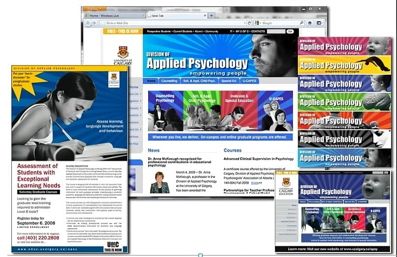
The University of Calgary’s Department of Graduate Educational Research and Applied Psychology is now proudly known as the Werklund School of Education.

After a comprehensive redesign of the University of Calgary’s Department of Education Graduate Studies brand and website, the Associate Dean proudly presented the new look to her colleagues. Their reaction was swift and critical: “It looks too commercial. It will undermine our reputation as a research university.”
Understanding their concerns, I knew they feared the new design might tarnish their academic prestige, making them appear more like a trade school. With my own master’s level education and extensive experience working with universities, I recognized the delicate balance needed. I believed I had achieved it, knowing their apprehension stemmed from unfamiliarity with persuasive advertising design.
She realized the potential professional misstep, especially given her colleagues’ strong opinions. Yet, she trusted her instincts and my expertise in creative direction. “Make the changes and go live with it!” she declared, taking a bold gamble by going against academic tradition and her colleagues’ views.

Rebranding the Werklund School of Education
When the University of Calgary began rolling out a new website design, the massive scale of the institution meant that some departments faced extended delays. The Associate Dean of the Faculty of Education and Applied Psychology, eager to modernize her department’s online presence without waiting, secured approval to hire an independent web designer and marketing specialist—me. My task was clear: create a brand and digital presence that matched the dynamic quality of their graduate programs.
The outdated website was harming their image, portraying the department as stagnant rather than forward-thinking. The Associate Dean envisioned a rebrand that would tell a compelling new story—one that reflected their excellence and vision. This rebranding needed to address not only the Department of Education but also its graduate divisions, each requiring a unique narrative and cohesive visual identity.
Through extensive collaboration, I developed a brand strategy emphasizing:
- Brand foundation language: Clarifying their core message and values.
- Tone of voice: Striking a balance between academic authority and approachability.
- Brand identity: Crafting visuals that resonated with students and faculty alike.
This was about more than design—it was about rediscovering the department’s excitement for its mission and ensuring it shone through in every detail.
Website Redesign
The previous website resembled a relic from the Web 1.0 era, with static content, limited interactivity, and dated aesthetics. My redesign embraced Web 2.0 principles, bringing modern functionality and a vibrant user experience to life. Key improvements included:
Dynamic Design and Enhanced Usability:
- Introduced a sleek, magazine-style layout with modern fonts, color palettes, and expressive photography.
- Rebuilt the site’s structure for easier navigation, linking related content and standardizing tools for consistency.
- Integrated interactive features like preformatted email templates and online forms, simplifying student-professor communication.
- 2.Content Revitalization:
- Encouraged faculty to update profiles with personal and professional achievements.
- Featured interviews with current graduate students to highlight program quality.
- Added a frequently asked questions section to address common inquiries and reduce support calls by 33%.
- Engagement and Resources:
- Introduced event coverage, alumni profiles, and downloadable resources such as applications, timetables, and grant information.
- Integrated multimedia elements, including videos showcasing departmental achievements.
Results That Speak Volumes
The transformation wasn’t just aesthetic—it produced record-breaking outcomes:
- Traffic Surge: Within four months, site traffic increased tenfold, attracting tens of thousands of new visitors globally.
- Application Growth: Graduate applications soared from 923 to 1,865, more than doubling enrollment interest.
- Staff Efficiency: Support staff enjoyed improved workflows, spending more time with students and fostering better engagement.
- Endowment Secured: My work contributed to a landmark $25 million endowment from the Werklund Foundation in 2013, leading to the renaming of the Faculty of Education as the Werklund School of Education.
This project demonstrated the power of strategic branding and thoughtful design in reshaping perceptions and driving measurable success.
Record-Breaking Results: The redesign and strategic online advertising led to a record-breaking number of graduate program applications, jumping from 923 to 1,865.
Visitor Growth: Attracted tens of thousands of new visitors from various regions.
Enhanced Site Structure: Added downloadable resources, improved search capabilities, alumni profiles, and interactive forms.
Reduced Support Calls: Reduced support calls by 33% by addressing common inquiries with a comprehensive FAQ section.
Achieved Endowment: Secured a $25 million endowment for the Faculty of Education through persuasive presentation. My work on the rebranding and redesign of the U of C Department of Education and Applied Psychology, and my help with the proposal, helped to secure a donation from the Werklund Foundation in 2013. The Foundation endowed the University of Calgary’s Faculty of Education with the largest donation ever received by an education faculty in Canada. In recognition of his generosity, the faculty was renamed the Werklund School of Education.

As Web Master and Marketing Communications Specialist, I rebranded the graduate programs for the Department of Education and Applied Psychology. This involved redesigning and rewriting all of their marketing materials and website, creating online advertising, developing social marketing and content.
RESULTS
By rebranding & redesigning the 2 divisions’ websites, advertising and marketing materials, I increased income from courses, maximized enrollment, and improved awareness and reputation of graduate programs. With the website, I improved useability & usefulness, increased site visits, & conveyed the exceptional features and benefits of programs. I gave it: an improved site structure, downloadable forms & materials, a search engine, graduate student profiles, faculty profiles, answers to frequently asked questions, and online contact & feedback forms. Both graduate programs received the most applications to their graduate programs than they ever had in their history of their operation! My presentation design helped the Faculty of Education secure a $3.1 million dollar endowment from the Werklund Found.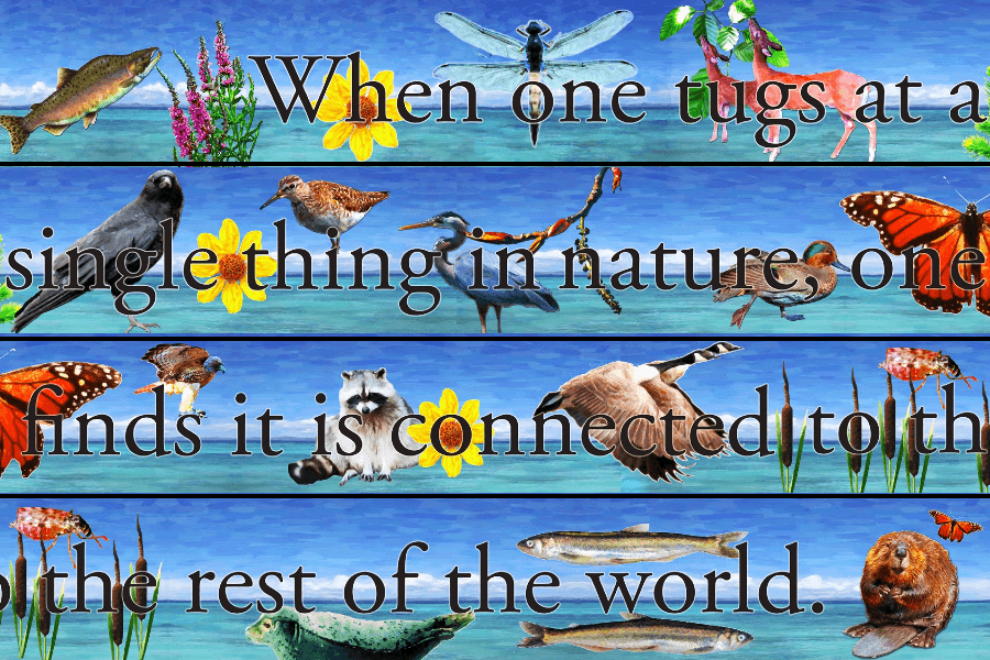
Flora and Fauna
Outdoor Art Commission for Pier Redevelopment,
City of New Westminster, BC
January 2012
Imagine contributing to a city’s architectural development that celebrates and sustains its local flora and fauna, while engaging young minds through play! This vision inspired me to submit my proposal to the City of New Westminster in BC, and I was thrilled to be selected for this unique project.
For the Pier Redevelopment, I created an outdoor mural featuring iconic images of flora and fauna native or naturalized to the area. This mural was commissioned by the City of New Westminster and designed in collaboration with biologist Gary Williams from GL Williams & Associates, ensuring scientific accuracy and geographic relevance.
The mural was crafted using digital photography-based applications, printed in full color, and sealed with a durable plastic coating to withstand all weather conditions throughout the year.
A phrase that perfectly encapsulates the spirit of this project is: “When one tugs at a single thing in nature, one finds it connected to the rest of the world.” Though it sounds like a famous quote, my research revealed it has no specific attribution. This phrase beautifully aligns with the eco-friendly design of the pier, the playful depiction of flora and fauna, and the inspiration to appreciate the interconnectedness and importance of nature in our lives.
The final three images in my portfolio showcase the site before redevelopment and the building plans for the children’s park where the mural is displayed.


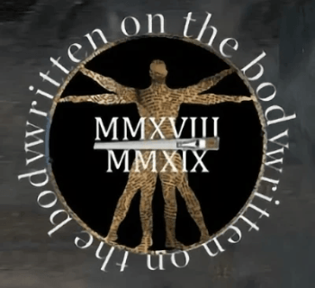
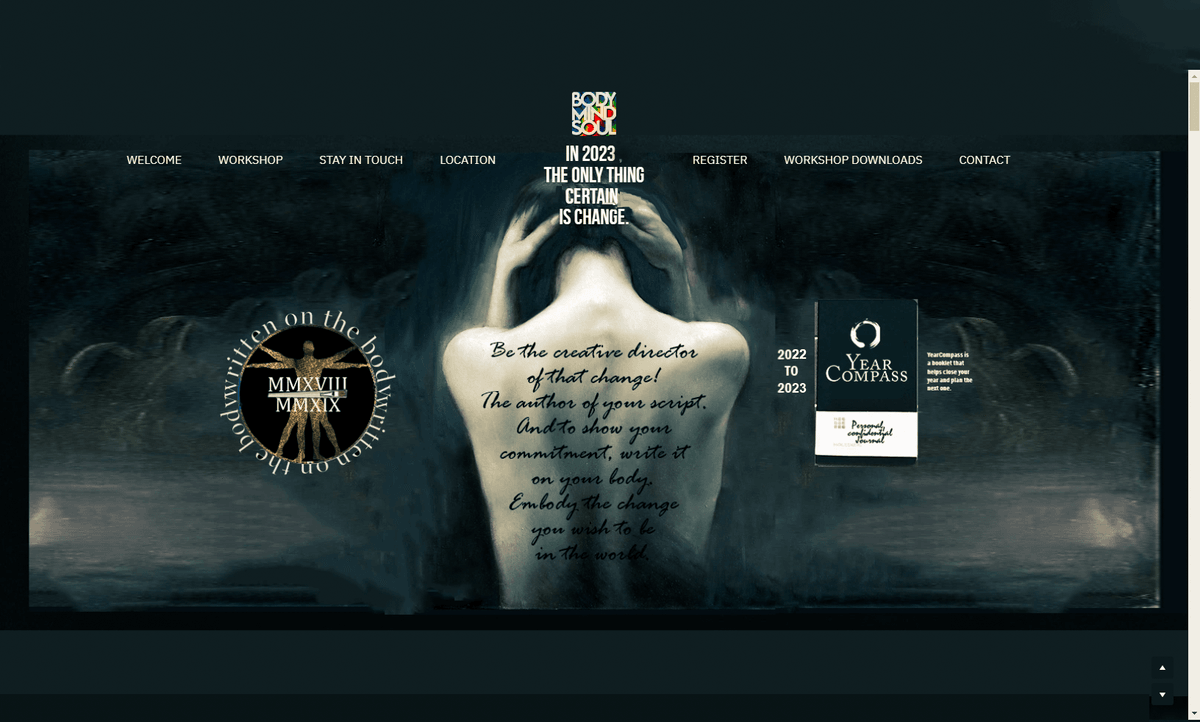
Written on the Body:
Embody your story, author your life.
The logo for “Written on the Body” shows how simple symbols can convey complex ideas. A skilled graphic designer uses symbols like a second language, finding connections between seemingly unrelated events and ideas. This story illustrates how a creative mind navigates toward solutions.
This workshop emerged from my graduate studies, exploring the relationship between words and the body, particularly tattooed words. How do they interact, and what dialogues arise? This can be seen as “mind vs. feeling” or “nurture vs. nature.”
I created a multimedia exhibit, “The Tattooed Other,” examining the role of tattooing in the lives of six individuals. Despite our evolution from tribal societies to the information age, tattooing remains relevant. I found that people turn to tattoos after transformative life experiences, using symbols to map and embody these changes.
In an age of abundant information, where tragedies and gossip coexist, meaning can be lost. The profound and the profane are less distinct.
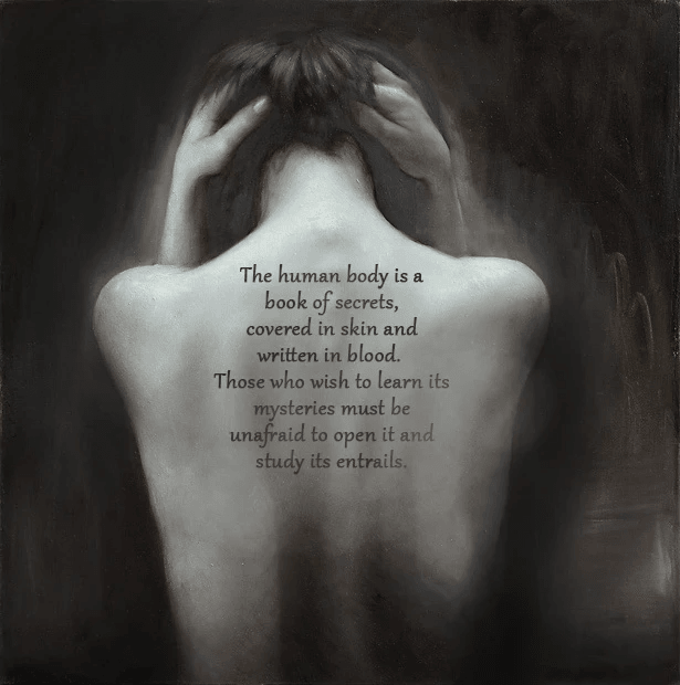
As an artist and activist, I aimed to counteract this. Imagine a workshop where experiences are felt, not just recounted. Each lesson becomes a brushstroke on your future canvas. This workshop helps participants to re-member (make part of the body) allowing the experience to have meaning, and using it to grow, and possibly transforming us.
This workshop would also be helpful to entrepreneurs and company owners. Understanding the motivations that created your company strengthens the unique identity of the business entity you bring to life. By understanding it's relationship to you and seeing it as a separate life, you can clarify its characteristics, which lead to unique business processes and a character that is expressed through branding. In much the way you come to understanding your children.
Title Text
A small tagline
A sentence or two describing this item. Lorem ipsum dolor sit amet, consectetuer adipiscing elit, sed diam nonummy nibh euismod tincidunt ut laoreet.


BodyMindSoul Bodywork. The phrase “body, mind, and soul” gained popularity in the 1970s, reflecting a resurgence of Indian philosophies that emphasized their interconnectedness. The visual alignment of these four-letter words symbolized their unity, making the concept easily recognizable and metaphorically consistent with holistic philosophies.
The 1960s to mid-1970s hippy counterculture, influenced by European social movements and Eastern spirituality, embraced free love, rock music, shared property and drug experimentation. This lifestyle introduced new perspectives on drugs, freedom of expression, appearance, music and work, promoting liberal political views and opposing the Vietnam War, commercialism, and societal norms. Hippies adopted tie-dye, using secondhand folk and tribal fabrics to create an anti-consumer fashion statement.
The logo’s tie-dye background connects to this counterculture, adding a vibrant, positive energy that stands out. “Bodywork” was included to highlight the massage therapy focus of the company.
For the advertising campaign, a photograph of renowned Moraine Lake’s crystal-clear waters in Banff National Park near Calgary, and the Rocky Mountains’ snow-covered peaks was used, which convey "nature" and "peace." Meditation courses often encourage choosing a place that evokes deep tranquility, perfectly aligning with the brand’s ethos. The "edge" to the image that makes others look at it twice is that the man is floating and could be having a near death experience (NDE). Many designers believe that if an image makes you look twice and requires your brain to think about it, it will be more memorable. It paradoxically communicates both messages.


